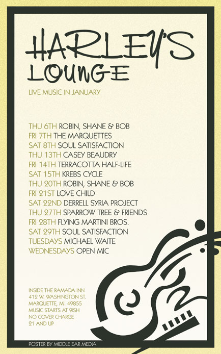
Happy New Year everybody! I wanted to start out 2011 with a clean, refreshing design. The January poster for Harley’s Lounge represents this with special attention paid to the white space (a.k.a. negative space) between elements. This gives it a very well balanced and inviting look. The design is framed by a dual border of yellow on the outside and dark gray on the inside. The light khaki background has a subtle noise texture added.

An abstract guitar graphic is located in the lower right corner and overlaps both borders, though because it is the same shade of gray as the inner border, it seems to be connected.
The color scheme is very simple. It consists of dark gray which is used for the title and the band names, and yellowish-green which is used for the dates and small print. I used two fonts for this design. NevisonCasD was used for the title because its hand-written style ties together with the curves of the abstract guitar graphic. Kabel Bk BT was used for everything else. The copy is left justified and presented in all caps for increased readability.
Harley’s Lounge is one of the few venues in Marquette that supports local music and I am proud to design their monthly posters.


Leave a Reply