I’m very pleased to announce the roll out of an e-commerce website for Dead River Coffee. They are located downtown Marquette, Michigan and are the area’s premiere coffee roasters. Go ahead, ask anybody. For years, the only way to get your hands on their fresh roasted coffee beans was to drive down to their shop and pick it up. Now this great coffee is available to the world at the click of a button.

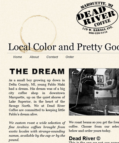
The site was designed with stark minimalist intention and a purposeful simplicity to invoke a simpler time. The color scheme consists of only black, gray, and cream. The background is a textured cream color. The logo at the top is the same logo they use to stamp on a plain brown bag before filling it with the coffee beans of your choice. The logo, tag lines, page titles, and all other text are either black or gray.
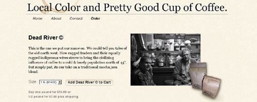
Embellishments include the prominent use of tag lines in the header and footer, a large ring-shaped coffee stain in the upper left of the header, a custom coffee cup with coffee stain under it that separates the footer from the content of each page, and the one pound and half pound bags full of beans that overlap the photos on the product pages.
Also featured is a horizontal drop down navigation menu located under the header, a three-column layout for the main page, and beautiful black and white photos scattered throughout the site.
WordPress was used as the CMS. Several things were made possible by this including movable modules and dynamic content on the main page. The movable modules are actually text widgets that can be easily rearranged or exchanged in the administration panel of WordPress. Some of the content on the main page is added dynamically by pulling content from the “About” page and the “Order” page. Also, there is blogging functionality. The posts gets displayed in the “latest news” section.

I used some CSS styling techniques to make adding new photos easier. New photos added to the main page are automatically re-sized to match the width of the columns while still retaining their original ratio. Also, a thin dark border is added to all photos for consistency.
Last but not least, this is a fully functioning, fully integrated e-commerce site. The ordering process works precisely as one would expect. From each individual product page, or from the main order page that lists all products, a visitor can select one-pound or half-pound as the size and hit the “add to cart” button to begin the ordering process.
A shopping cart opens up as a modal window and displays all items in the cart, quantity, price and subtotal. It allows the visitor to modify the quantity, and displays an updated price and subtotal. By pressing the “check out” button, the visitor is taken to the “check out” page which is fully integrated with the same look as the rest of the site.
From here, the visitor can securely enter their private information. After filling in the “City”, “State”, and “Postal Code” fields, shipping is automatically calculated and a new total is displayed. By clicking “confirm your order” the transaction is sent to be processed and the visitor is shown a receipt page they can print for their records. An email receipt is also sent to the visitor.
The layout was designed to be flexible and allow for growth of content in the future. The site is being maintained by Theo at Dead River Coffee so bookmark it and check back often for updates. Seriously, if you like fresh roasted coffee beans, this is the place for you!

Leave a Reply