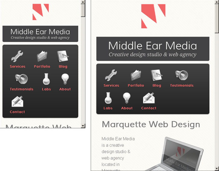
How to make your site awesome on any device, on any platform.

Mobile is Growing Fast
Responsive Web Design is the future. The World Wide Web is expanding. It’s not just available from your desktop anymore. The web can now be accessed from many devices such as Televisions, Telephones, Tablets, etc. More people are able to access the web than ever before. The mobile market, in particular, has exploded along with the recent popularity of smarter phones and tablets.
Over the last year, mobile visitors to middleearmedia.com have doubled. That’s a 100% increase. Although mobile visitors only make up about 5% of the total traffic to my site, this number will change drastically in the next couple years.
Customizing or Optimizing User Experience
The growing number of Internet-ready devices gives rise to the need for customizing or optimizing user experiences. There are (at least) two ways to go about tackling this issue.
Multiple Sites, One for Each Device
You could create multiple sites, one for each device you’d like to target. Unessential elements can be removed, and information can be restructured to be easier to read on each device. There are problems with this technique though. As the number of devices rise, so does the complexity of the design. This could be very time consuming for the developer and therefore likely to be very expensive. Remember when cross-browser compatibility was all you had to worry about?
Also, users often get frustrated when they feel like they’re being served a dumbed-down version of your site. Multiple sites can be confusing for users trying to share links. If you’re not careful, having multiple sites could confuse Google as well. If you don’t tell Google both sites should be treated as the same site, Google sees duplicate content. That could actually lower your SERP ranking!
One Site for All Devices
There is a concept that’s been floating around lately called The One Web. Addy Osmani discusses it in more detail in his article The One Web: don’t write for devices, write for people. In fact, the title of his article alone sums it up nicely. The devices we use to access information and to communicate will continue evolving, along with their abilities and requirements. Writing and designing for specific devices is only a short term solution, and a step in the wrong direction.
Therefore we must design the web to be more flexible and adaptable. After all, didn’t the inventor of the World Wide Web, Tim Berners-Lee, say “The primary design principle underlying the Web’s usefulness and growth is universality.” in his article for Scientific American?

What is Responsive Web Design?
Wouldn’t it be great if there was a way to make your site usable on any device? There is. It’s called Responsive Web Design. Simply stated, its the creation of a site that is able to adapt to the context in which it is being viewed. In other words, it responds to a user’s behavior and environment based on screen size, platform and orientation. In his book, Responsive Web Design, Ethan Marcotte discusses the three essential elements needed to create a responsive design:
- A flexible, grid-based layout
- Flexible images and media
- Media queries
Media queries
I’ll skip over the first two and jump right to the interesting part. And now for the stuff you’ve all been waiting for… that’s right, media queries! A media query is a part of CSS that will allow you to serve a specific set of rules to certain devices, but only the ones that fulfill certain criteria. So instead of delivering different sites to different devices, the same site is delivered with unique customizations for each device.
@media screen and (min-width : 800px) {
	html {
		background-color: red;
	}
}
In English: Any device that outputs to a screen and has a minimum width of 800 pixels should show a red background. Of course, this is a very simple example, but I hope you can see the potential.
Note on Pixel Density
One important factor to note is that pixels are no longer pixels. New devices are emerging with various different pixel density’s. A font-size of 16px could end up looking like a tiny speck on a device with a higher pixel density. Once upon a time, you could tell the browser to do what you wanted, and it would listen. You used to be able to set a meta-type in your page saying:
meta name="viewport" content="width=device-width"
In English: The with of this page should correspond with the with of the device.
However, modern browsers are clever. They’ll try to automatically zoom in or out to compensate. That sort of defeats the purpose of running the media query in the first place. Fortunately we can solve that problem by setting an initial scale in our meta-type.
meta name="viewport" content="width=device-width, initial-scale=1.0"
In English: Force the browser to treat one pixel as one pixel on all devices.
So, forget about creating the perfect mobile experience. If your site is designed responsively, using a flexible layout, media queries, and some meta-type adjustment, you can create a wonderful experience for all of your users. You’ll have one site that will work on any platform, any device.
Responsive Web Design is the future.

Leave a Reply