
Advanced Materials Processing Corporation (AMP) is a Thin Film Coating company based in Lowell, Massachusetts. They offer Service Manufacturing to the high-technology sector by adding value and performance to other companies parts and products. I recently designed and developed a new website to help give AMP a professional online presence.
Features of the AMP Corp. Website
The AMP Corp. website is designed to capture attention, create engagement and to trigger positive emotional responses. For the overall design style, I wanted to integrate key concepts of the business. This was accomplished by using textures and layers to invoke materials and surfaces.
The design starts with light tinted sections at the top (except the dark navigation menu) and gets progressively darker towards the bottom. This gives a pleasing weighted balance to the design.
There are subtle textures used throughout the design. The section just below the navigation menu is textured. The footer section also has some texture. This helps give the design character and depth. The textures give the impression of a real material surface in the background.
An old-style/transitional serif typeface (TeX Gyre Termes Bold) is used for display type including page titles, section titles, and sub-headings. This was visually matched with the typeface used in AMP’s logo. Tex Gyre Termes Bold is embedded as a webfont to ensure all visitors are able to experience the same letters. A sans-serif typeface is used for body copy and everything else because it is more legible at these small sizes. The two different typefaces pair well together because of their similarities in letter shape, x-height, and letter spacing. Together, they help give the design a professional and classy feel.
AMP Corp. Header
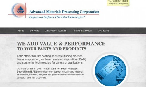
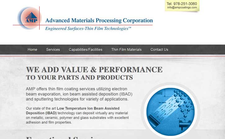
The header is the section at the top of all pages. It includes the AMP logo (site title and tag line), telephone number, email address, and main navigation menu.
Because of the overly complex nature of the AMP Corp. logo (5 overlapping and intersecting shapes, 2 colors, 2 gradient tints, 2 typefaces and 3 type styles), its separated from the surrounding elements with a generous amount of white space. This gives it room to breathe.
To the right of the logo, is the telephone number and email address. This allows visitors to immediately see the contact information when they come to the site. It also helps visually balance the logo which is heavily weighted on the left side. This information is contained in a light yellow box with a curled up corner that resembles a sticky note.
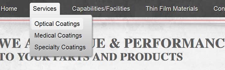
Underneath is the main navigation menu. The menu background is dark gray. The links are white and use the sans-serif typeface. The hover state for links in the menu is a light gray, rounded box with dark gray text. Also, there is a drop down feature to the menu. The titles of the three services pages will appear below when a user hovers over Services. Just below the menu is a thin red line that creates a repetition of the red line in the logo. This element is repeated elsewhere as well such as the red underline for hyperlinks etc.
AMP Corp. Content
Everything between the header and footer on the AMP Corp. website is page content. The content area for the homepage is split into three areas. All other pages contain only one content section.
The first section introduces the company and contains information about what AMP does. This section is light gray and textured. The large section title in all capitals communicates what the company does in terms that anybody can understand instantly. It also speaks directly to potential clients. This is important for capturing attention and setting the tone.
An image diagram of IBAD technology is located to the right. This creates a dynamic yet balanced feel to the layout. The image diagram I was given looked like a low quality scan from an old textbook. While a picture can be worth a thousand words, this image was definitely not. That’s certainly not the impression I wanted to give visitors, especially since AMP Corp. is attempting to target high-tech industries. To make it work, I made some enhancements. Its now surrounded by a circular frame that creates a repetition with the circles used in the logo and fits well with the surrounding text. It is tinted blue to create continuity with the blue in the logo. This creates a very pleasing aesthetic.
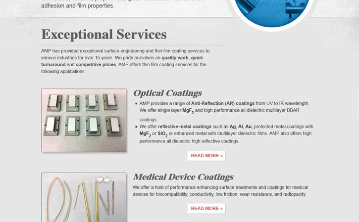
The second section contains information about AMP’s services. This section is medium gray. There is a large section title with a short horizontal rule (line) underneath it. Below the descriptive paragraph, the services are laid out in three sub sections. Each service section includes a medium sized title, a short excerpt, an image, and a “READ MORE” link. The small, low quality images have a thin dark gray border and light gray drop shadow. To make the “READ MORE” links more engaging, I created white buttons with red text in all caps and a double right carrot (bracket arrow).
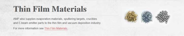
The third section contains information about thin film materials and a link to that page. Hyperlinks are red and underlined with red. When hovered over, the linked words turn blue but the underline stays red. In the hover state, hyperlinks resemble the company name in the logo. In capable browsers, there is a subtle transition fade between colors when users hover over hyperlinks.
AMP Corp. Footer
The footer is the section at the bottom of all pages. It’s split into two areas. The footer widget area and the footer credits area. When viewing websites, we almost always start at the top and finish at the bottom. It is vital to give visitors a reason to stay on a site, or even better, a call to action that they can initiate. The footer widget area contains information about AMP, Contract R&D, and various methods of communicating with AMP. The call to action is the “Contact Us” section and ultimately the link to the contact form. This entire section is textured medium dark gray with light gray text and white hyperlinks.
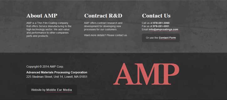
The footer credits area contains copyright information, AMP’s physical location, and a credit (with hyperlink) to Middle Ear Media for creating the site. This section is textured dark gray with white text. The hyperlink to Middle Ear Media is white and underlined red. The hover state is red text and white underline. I used the A, M, and P from the AMP logo to create a large, simplified AMP icon. The AMP icon is red. This AMP icon helps balance the footer, and reenforce the company’s brand.
AMP Corp. Contact Form
The contact form is designed with the user experience in mind and has some advanced features built in. The input fields have subtle hover and focus effects. These effects help clue in the user as to which field is currently selected. The Request field is a text box that can be resized by clicking and dragging in the lower right corner of the field. This allows users with lengthy requests to see the entire message without scrolling.
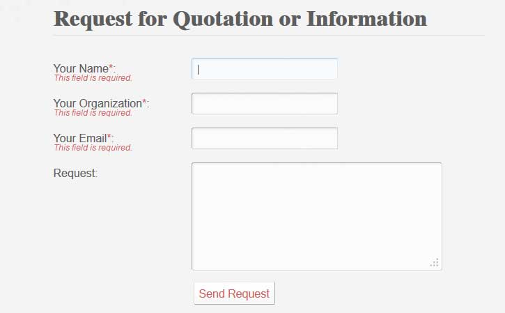
The Name, Organization, and Email fields are all required, but that’s not all. If the required fields aren’t filled out, or are filled out improperly, helpful hints are revealed and the user is given the opportunity to correct any errors before attempting to resend. The Name field must have at least two characters. I can’t think of any real names that have less. This prevents someone typing a single character for a name. The Email field must contain a valid email address. This means a name followed by the @ symbol followed by a domain name and suffix.
When a message is sent successfully, a notice appears on the page saying “Thanks! Your request has been sent.” Shortly thereafter, AMP receives a nicely formatted email with all of the information given in the contact form.
Leave a Reply