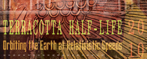
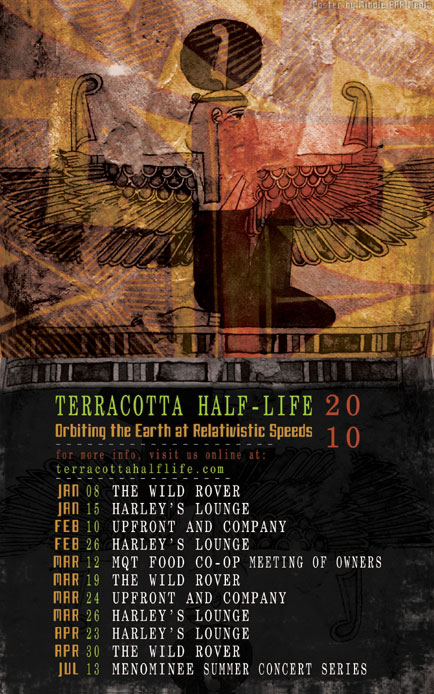
I just finished a new poster design for Terracotta half-life. The poster lists gig dates for the first half of 2010 as well as the band’s website. I based this design on some ancient Egyptian art. It has a gritty feel due to the use of subtle textures and shades of dark gray. This darkness of the bottom half is contrasted with multiple layers of warm colors and patterns on the top half.

There are two fonts used. One is a mono-spaced serif that looks like it could be from an old printing press, and the other is very futuristic. I used these to impart a sense of timelessness. By using the same warm colors from the Egyptian art on the text, the bottom half is tied in with the top. I also used green and white, two colors that were taken directly from the color scheme at terracottahalflife.com in order to create some continuity of branding.
Terracotta half-life is a musical group based out of Marquette, Michigan that I started about five years ago. Performing with the group are some of the areas finest musicians. Over the years I’ve designed Logos, T-shirts, Stickers, and many Posters for the band.


Leave a Reply