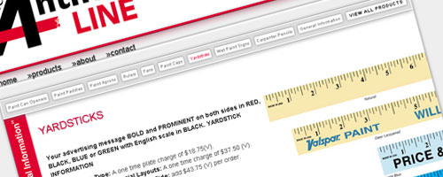
Although Anthony & Co., Inc. has been producing advertising specialty items for over fifty years, I’ve only been designing their web site for twelve. The last major update was done about three years ago, so I was glad to get a chance to redesign basically from scratch. The idea here was to create a simple, modern design that matched the look of existing brochures.

This web site was designed with PHP in order to utilize some of it’s advance features. A modular design was implemented to reduce redundancy. So, any element of the design that is repeated on multiple pages was written in a separate file that is added dynamically when the page loads. Also, the date in the copyright section of the footer automatically updates on the first of every year.
I used some CSS trickery to add some nice features. For instance, the main navigation bar knows what page is currently loaded and styles the corresponding link to let the visitor know what page they’re on. These particular links are also made non clickable since they lead to the same place. This should help to reduce confusion for the user.

Speaking of which, I wanted to make navigation very easy and intuitive. The product pages have a sub-navigation section with links to all product pages so all the products can be reached easily. These links, like the main navigation, behave differently depending on which page is loaded.
Each product page has a reminder about artwork specifications running vertically along the left edge. When clicked, the general information page is loaded. Also, to save the users from extensive scrolling, a “Back to Top” link was added to the lower right hand corner of all product pages.

Another cool feature is located on the main product page. Images of the products are laid out in a thumbnail gallery. Using CSS sprites and the JavaScript library JQuery, I added an animated hover effect that turns the image to gray scale and fades in a dark inner glow.

Leave a Reply