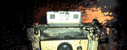
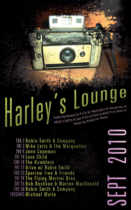
The September poster for Harley’s Lounge features a photo of an old Polaroid camera at the top. This camera represents those special moments in life that can be captured instantly, but will eventually fade away to be replaced by others. The camera sits on a wooden shelf and is peaking out from underneath a dark, grimy texture with the overall effect resembling old film that wasn’t stored properly or maybe a photo that was just pulled from a fire.

Only one font, Zurich LtXCn BT was used for this poster. It is a clean looking, easy-to-read font that contrasts with the dirty, grungy background. The title and the band names are green, the dates and details are purple. These aren’t just flat colors though, because I’ve employed a subtle gradient on them to make them stand out more.
Harley’s Lounge is one of the few venues in Marquette that supports local music and I am proud to design their monthly posters.


Leave a Reply