Save The Wild UP is a non profit organization that operates in the Marquette area. Through public awareness and education they strive to protect the Upper Peninsula of Michigan from unsustainable development, degradation and dangerous contamination. Their original web site was designed in 2007 and had been modified numerous times since. It was in need of a major overhaul both in terms of user experience as well as content management. I redesigned their site to solve both of these issues.
Content Management
When the site first began, it was made of static HTML pages. Over the years, modifications were made. Content was added. Structural changes took place. A blog was added. Several databases were being used for various purposes. A lot more content was added. The original site wasn’t flexible enough to scale up with the organization as it grew.
The disjointed structure of the site made editing it very time consuming. Adding content was similarly time consuming and confusing. Blog posts could be made in the Content Management System, but all other content had to be added as HTML pages and uploaded via FTP. Also, special scripts had to be included so the home page would display recent blog posts.
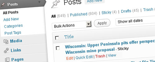
In order to make things simpler, I redesigned the site to function entirely within a Content Management System. Now everything is connected and can be controlled from the Administration panel. Content is added there and content is edited there. The site is now completely scalable.
I also helped Save The Wild UP formulate content management strategies. Because the site contains so much content, it is imperative that the content be organized properly. Taxonomies including “Categories” and “Tags” can now be used to their full potential.
Organization and Navigation
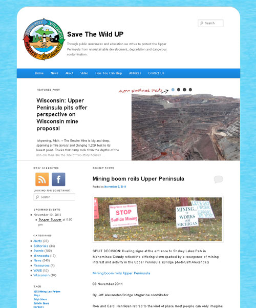
The new site has improved organization of content and a logical layout. With roughly 20 pages and over 600 posts, proper re-organization of the main navigation menu was key to the redesign. To reduce the visual clutter, many of the items have drop-down options. Now a user can find almost everything in one place. The same place on every page.
If a user doesn’t know what section the information they are looking for is located, they can use one of the featured search boxes to find it. There is a search box in the upper right-hand corner of the site as well as in the sidebar of the homepage.
Also, blog posts can be viewed by the category, tag, or date published. This makes sifting through mountains of information and finding specific posts extremely easy.
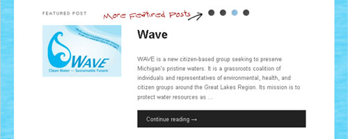
The homepage (and several other pages) use special page-templates to dynamically combine elements in a user-friendly way. Just below the navigation menu is the Featured Post section. This area links to the most recent featured (sticky) post with a title, excerpt, and image if applicable. It also includes small links that bring up all other featured posts in a similar manner.
Below the Featured Post section is the Recent Posts section. This shows the ten most recent posts, excluding featured posts. The most recent post is shown in its entirety. Below it, the titles of the nine next most recent posts are listed as well as the number of comments for each.
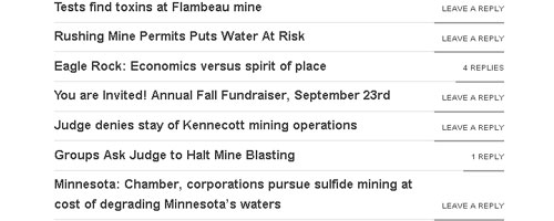
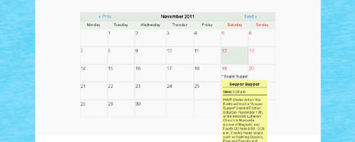
To the side of the Recent Posts section is what is commonly referred to as a sidebar. The sidebar on the homepage contains social networking icons, another search box, a list of categories (each showing the number of posts within), and a tag cloud. The tag cloud was restyled as a list to be more readable. Also shown in the sidebar when applicable is a list of upcoming events based on the event calendar.
The news page (as well as all the category, tag, and archive pages) follows a standard blog layout. The sidebar on these blog-related pages contain social networking icons, categories, five most recent posts, five most recent comments, monthly archives, other links of interest, and the tag list. However, when viewing a blog post on its own page, the post is centered without a sidebar to enhance readability.
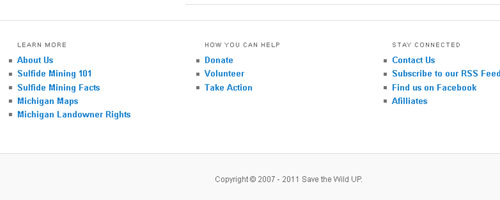
Near the bottom of each page is an area commonly called the footer. The footer contains several lists of various links to help retain the readers attention after reaching the end of an article or the bottom of a page.
Responsive Layout Design
Last but certainly not least is the responsive layout design. What’s that, you say? Responsive layout design means that certain page elements are modified to behave a certain way when viewed at a certain screen size. For instance, the width of the site gets smaller as the screen size is reduced. When the screen size gets small enough, there isn’t enough horizontal room for the sidebar so it moves down below instead of forcing a horizontal scroll. Many other elements are shrunk, altered, or moved at various screen sizes. This helps create a much better user experience for all potential users, especially for those in the rapidly expanding market of mobile devices.
TIP: If you don’t have a smart phone or mobile device capable of browsing the web, you can see the effects of the responsive layout design simply by resizing your browser.
Leave a Reply