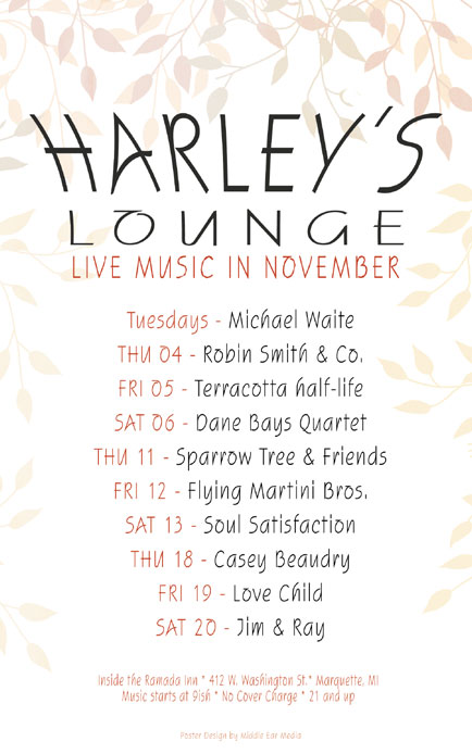
As the seasons change, it’s a good time to reflect back on the pleasant Autumn weather we’ve had this year. In the November poster for Harley’s Lounge, I wanted to pay tribute to the end of Autumn by using faded, discolored leaves. They poke in from the top and both sides to create a pseudo border. It also incorporates a subtle hint of what’s to come with a pure white background. Am I California dreaming? Maybe.

The color scheme consists of dark gray and rusty orange for the copy and faded yellow, orange, red, and brown for the leaves. The single font used throughout the design is SquireD. The copy is centered and is sized to lead the eyes from top to bottom.
Harley’s Lounge is one of the few venues in Marquette that supports local music and I am proud to design their monthly posters.


Leave a Reply