I just thought I’d let you know about a few changes I’ve made to this site (middleearmedia.com) lately. Nothing too drastic really, but I’d like to document the evolution here. Just some minor stylistic changes and progressive enhancements here and there. Most importantly, I redesigned my portfolio. I’ll get into more about that in a minute, but first let me tell you about…

Changes to header and sidebar graphics
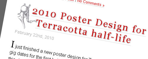
Subtle changes were made to the header and sidebar graphics. In the header, I changed the font for my tag line and also made it all caps.
Also, I added a new version of my logo in the empty white space underneath the tag line. I’m not totally happy with this because it seems too busy, but this is the way it will look for now anyway.
I’m very satisfied with the new background graphic for the sidebar headings which are now all caps. This is basically an extension of the brushed metal texture with a bit of depth added.

Text shadow added to titles
And finally, a text shadow was added to both the main headings and sidebar headings. This shadow really brings copy out from the background on the sidebar in particular.
Most modern browsers can now render the CSS 3 tag text-shadow. This change is a progressive enhancement, and as such, will render only if your browser is capable. If not, it looks exactly the same as it used to look.

Portfolio Updated
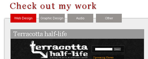
I’ve implemented a tabbed navigation system. This makes it easier to find what you’re looking for. The default tab when the page loads is Web Design, where you can see large images under each title.
Either the name or the image can be clicked to expand a section underneath with a smaller image or logo, a URL if applicable, and information about the project including Client, Date, Tasks, etc.

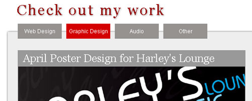
Additional tabs include Graphic Design, Audio, and Other. Again, content here is displayed as a name and image that are click-able to expand more details. Although there is some content in these tabs, I am still in the process of adding more.
Please leave a comment below and let me know if you like the new look and what you like about it, or what you don’t like and any suggestions.
Thanks.

Leave a Reply