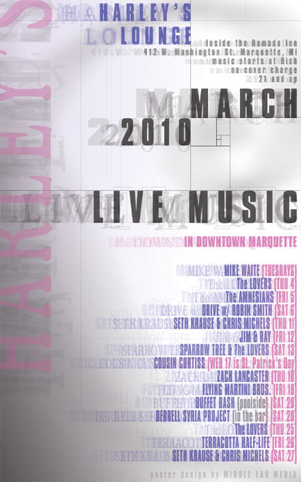
For the March poster design, I returned to the idea of doing a text based design that I had last month. The layout is loosely structured around the sacred geometry of a golden spiral that sweeps out from the bottom right corner and curves around from the upper left to the upper right corner where it closes in on itself.

I used many different fonts overlayed on each other to give a feeling of depth. The busyness of the fonts are balanced by the minimal color scheme including various shades of gray, purple, and pink.
The cool, simple effect matches the reality of March in Marquette, Michigan. Harley’s Lounge is one of the few venues in Marquette that supports local music and I am proud to design their monthly posters.


Leave a Reply