Grant M. Ryan is a talented photographer and a good friend of mine. He enjoys and excels at traditional celluloid black & white photographic productions. The knack for capturing that special moment in time and space is evident throughout his work.
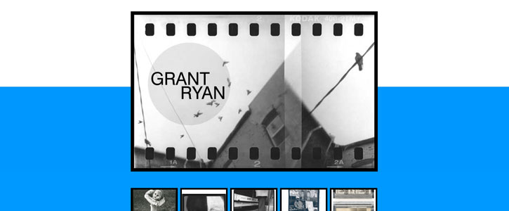
Although Grant has been refining his craft for years, he was in need of personal branding. In October 2013, I created a visual identity to fit his personality. This effort included a simple yet powerful logo as well as a mobile friendly, fully responsive website.
Grant Ryan Photography Logo
To capture the essence of Grant’s personality in a visual identity, I created a simple yet powerful logo for him. The logo consists of his name inside a light gray circle. For his name, I used a Swiss typeface in all caps. I split his first and last name onto separate lines, and aligned them to opposite sides of the circle.
Features of Grant Ryan Photography Website
I designed the site so that his work would be the main focus. It’s a simple one-page site that shows his logo, a thumbnail photo gallery, a short blurb and contact button. The color scheme is black, white & blue. The blue is used as the background color behind the thumbnail gallery. This gives the site a vibrancy that helps the thumbnails stand out.
Photo Gallery
When a user hovers a pointer device over the thumbnail images, the black border changes to a white border. This signals the user that they are clickable. When clicked, the full-size image is opened in an overlay window. From there, the entire photo gallery can be navigated. The full-size images can also be viewed in a slideshow.

Blurb
The blurb is just a short quote from Grant. He introduces himself and gives a little bit of background information about his work and education. The font-size is large so it’s easily readable. There is an oversize quotation mark set to the left of the blurb.

Call to Action
Their is only one call to action on the site and it is fairly obvious. The big blue “Contact Me” button stands out over the black background and should be easy for anybody to find. When clicked, it opens the user’s default email client with a message addressed to Grant.

Responsive Design & Development
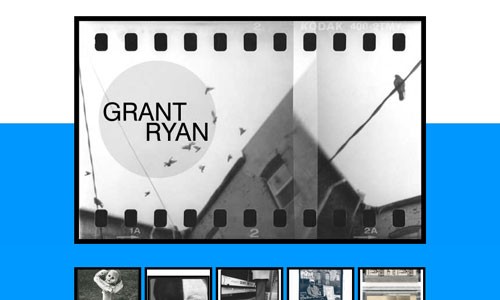
The site was built with responsive design techniques to ensure it looks good and works properly on any device including mobile phones and tablets. When viewed on small mobile devices, the simple logo is used. When viewed on medium to large devices, the logo is shown overlaid on Grant’s photo of pigeons.
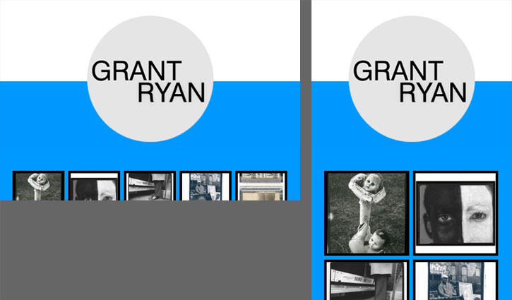
You can see what the site looks like on a smartphone. In the horizontal orientation, the thumbnails scale to fit the screen. In the vertical orientation, the 5×2 grid thumbnail gallery layout becomes a 2×5 grid. You can see this responsiveness in action by resizing your browser window, or just check it out on your phone or tablet.

Leave a Reply