Flat web design — a design style that highlights simplicity, clarity, honesty of materials, and of course flatness — has swept the web over the last year or so. This style of design is quite different from the once-dominating Skeuomorphic style where elements are made to look like real world objects. Will it be a short-lived trend or a lasting movement? Only time will tell. In this showcase, you’ll find 10 beautiful examples of flat web designs from all over the web that I hope will inspire you.
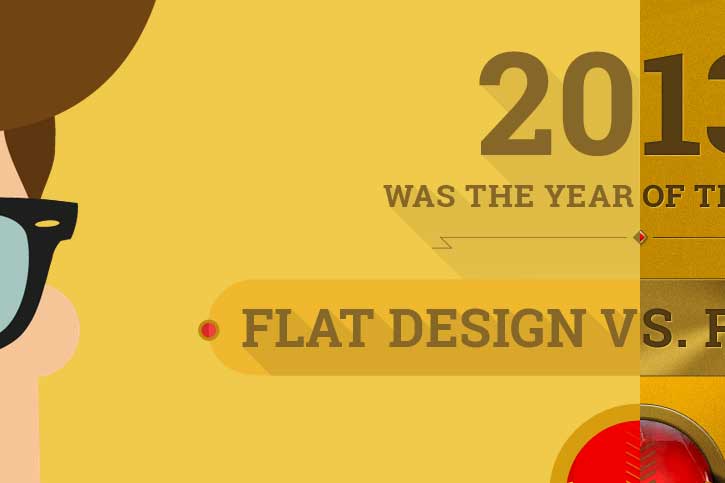
1. Flat VS Realism
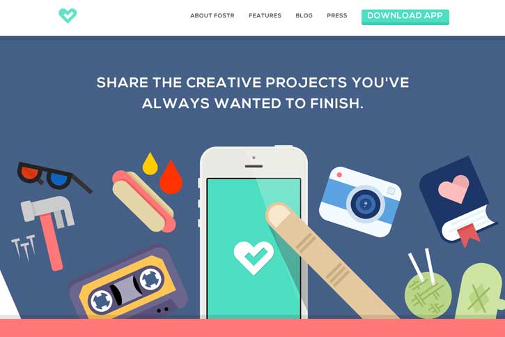
2. Build Conference

3. Fostr
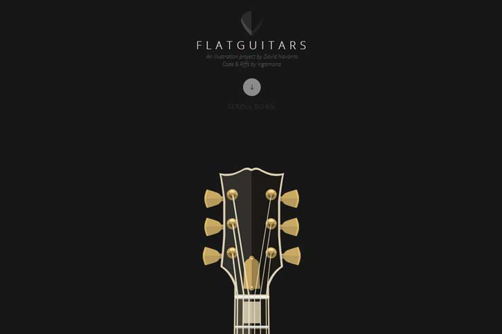
4. Flat Guitars
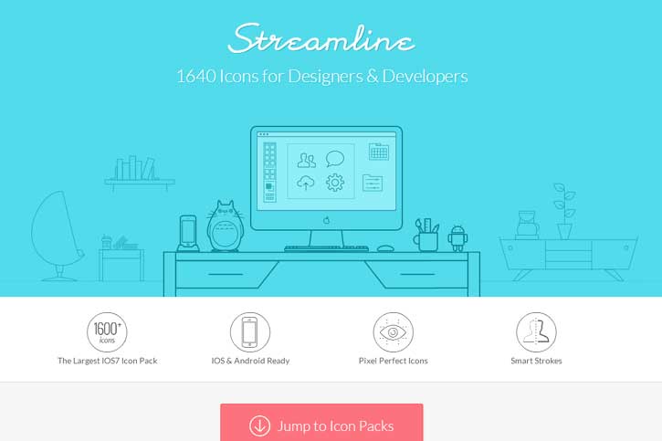
5. Streamline
6. unvael

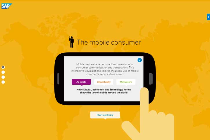
7. SAP Mobile Consumer Trends
8. Huxtaburger

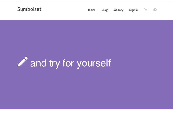
9. Symbolset
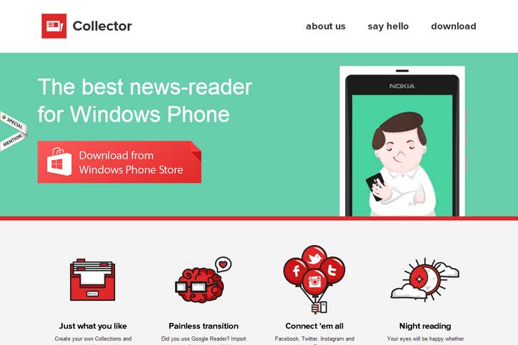
10. Collector
Conclusion on Flat Web Design
Obviously, nobody still thinks the world is flat. However, the screens we view things on every day are. While skeuomorphic design styles aren’t going to disappear anytime soon, I think the power of the minimalist philosophy behind flat web design will help it evolve and remain popular in the future.
I hope you enjoyed this showcase of flat web designs and found inspiration. If you’d like to share your thoughts on the subject of flat web design, drop a comment. I’d love to hear your insights!

Leave a Reply