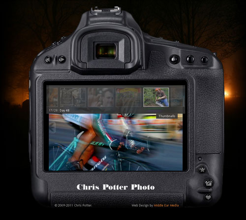
Chris Potter recently had me redesign his photography web site. The old site was in a blog format and contained his “photo a day” project, where he added a new photo each day for an entire year. For the redesign, he wanted to feature these photos prominently and make it easier to view all 365 of them. I took all of these images and combined them into one slideshow gallery. Then I framed the entire gallery in what looks like a view screen on the back of a camera.

Slideshow
The images are displayed in a slideshow format. Instead of sliding across though, the current image fades out while the next image fades in. Each one is visible for about eight seconds before fading to the next image. There are “previous” and “next” arrows located on the left and right sides of the view screen which allow manual navigation through the gallery.

Thumbnails
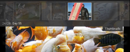
There is a small “Thumbnails” button located on the upper right corner of the view screen. This button activates the Thumbnail drop-down overlay. In the overlay, the images from the current gallery are shown as semi-transparent thumbnails. Hovering over them makes the thumbnails fully opaque. Clicking on one will load that image in the view screen. Also, hovering near the left or right edge of the overlay will scroll through the thumbnails at a rapid pace which is very useful in such a large gallery.
Buttons
Another interesting feature of the site is how I incorporated the existing buttons on the back of the camera by assigning them useful functions. They all have gray icons that become colored when hovered over. When clicked, the icons move down one pixel. This helps give the illusion that the button is being depressed.

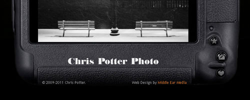
There are several utility buttons located in the lower right corner. The button with the star icon can be used to bookmark the site. The one with the envelope and pencil opens up an e-mail client and allows a user to contact Chris via e-mail. The button with the heart will share the page on Facebook.
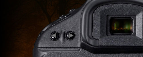
To reduce the initial loading time of the site, the gallery is separated into 12 months. To navigate between each month, there are gallery buttons with left and right arrows located in the upper left.

In order to give it a realistic effect, I paid close attention to detail. The background image of the site (Chris’s night-time photo of a cemetery) can also be seen in the camera’s view finder.
This gallery is just a small example of Chris Potter’s Photography. Look for an expanded site with more galleries in the future, and don’t hesitate to contact Chris for your photography needs.

Leave a Reply