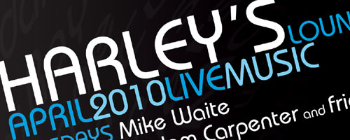
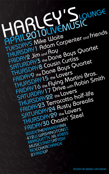
For the April poster design, I kept it fairly simple with a focus on readability. I used a dark gray to black gradient for the background, then added a very faint but highly warped version of the text for a little bit of attitude. Finally, I chose white, and a couple shades of vibrant blue for the text colors.

This creates a high contrast between the background and foreground for better visibility in dimly lit areas. The modern font, tilted slightly, is clean and easy to read. The use of all capitals (except for the band names) makes it even easier to read from a distance. Harley’s Lounge is one of the few venues in Marquette that supports local music and I am proud to design their monthly posters.


Leave a Reply