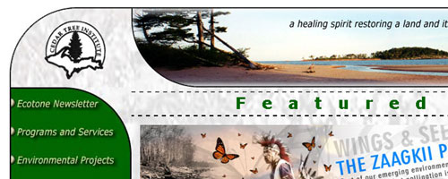
The Cedar Tree Institute is a nonprofit organization that initiates and provides collaborative services in the areas of mental health, religion and the environment. Years ago, I designed the original cedartreeinstitute.org and have been tending to it ever since. A completely new design was launched today. It features a horizontal drop-down menu for better navigability, a blog format with widgetized sidebar area, internal search functionality, and a new color scheme with mostly subtle colors and shades of gray. The idea was to match the look of the printed newsletter Ecotone, while making it easier for users to find the content they’re looking for.
New Design

Several years have passed since any major updates have been made to the Cedar Tree Institute’s web site. The first design was done in 2002 and underwent many small, evolutionary changes over the next five or six years.
Sometime near the end of 2007, a new design was rolled out. It featured an image rotator in the header and large rounded corners. It was, however, still based on the previous design and integrated older elements such as the background pattern and general layout.
Previous Design

The newest design offers a complete break from all the old designs and a fresh take on one of the most active non profits in northern Michigan.
While fully functional, there are a few more things I’d like to do in the near future. First, I’ll separate the home, about, and contact links from the main menu and combine them into a different menu located at the top of the page. This will enhance visual comprehension of the main menu. Second, I’ll add some customized stuff to the sidebar. Third, I’ll add a large image slider on the main page and possibly add multiple loops to show recent posts in several different categories. But until then…

Leave a Reply