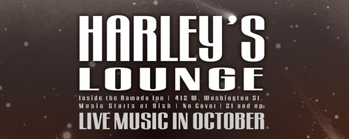
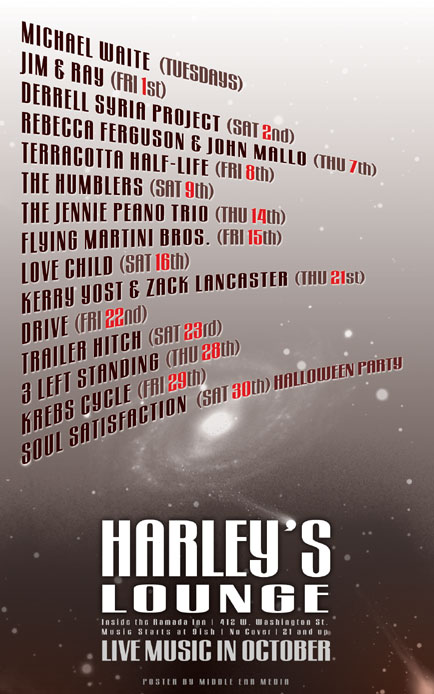
The October poster for Harley’s Lounge was inspired by The Twilight Zone. The intro scene to the television series featured a dark background with stars shining and various objects floating by as if they belonged in the depths of space. The poster includes a view of our galaxy from afar as the backdrop with the information floating about. Notice the apostrophe in “Harley’s” is also the tip of a comet hurtling through the cosmos with reckless abandon.

Only one font, Gogo BigL was used for this poster. It is a modern looking, blocky, sans-serif font. Various shades of red were employed for the band names and dates while the title and details are white and gray respectfully.
Harley’s Lounge is one of the few venues in Marquette that supports local music and I am proud to design their monthly posters.


Leave a Reply