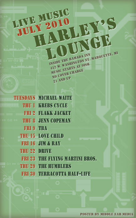
The July poster for Harley’s Lounge incorporates a military-industrial style in honor of my brother who recently re-enlisted in the service. The font used is Stencil BT for that “military crate” look. The color scheme for the copy is based on camouflage and includes various greens, rust brown and gray. A light drop shadow helps set the copy apart from the background.

The background consists of faded green schematics that look like they’ve just been pulled out of the glove box of an old jeep. Harley’s Lounge is one of the few venues in Marquette that supports local music and I am proud to design their monthly posters.


Leave a Reply