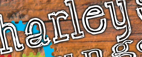
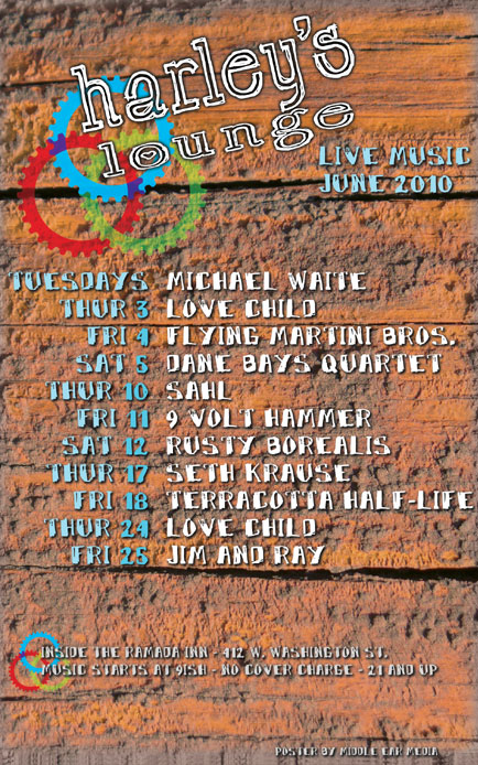
For the June poster design, I used a close-up photo of some old barn wood for the background. I love the rugged look of the wood. It has such a great, weathered character and so much depth. I added a little flare and contrast with three brightly colored gears. The way the gears overlap each other combined with the bright colors almost make it look like a bouquet of flowers.

I wanted the words to look somewhat hand drawn, but very legible. I kept the font colors very light with white, blue, and gray. Two fonts were used, one for the title, and the other for everything else. Both have rough edges and irregularities that give them a hand drawn effect.
Also, drop shadows help set the copy apart from the background and improve readability. The final design is an interesting mix of historical character and energetic vigor. Harley’s Lounge is one of the few venues in Marquette that supports local music and I am proud to design their monthly posters.


Leave a Reply