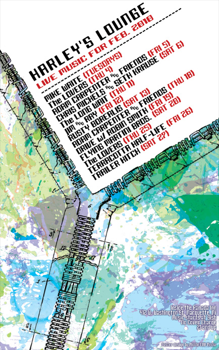
I felt like doing something different for February. At first I was thinking about doing a completely text based design, until I had a vision of a zipper. I’ll save the text idea for next month.

The lower portion is a colorful spattering of blues and greens. This area is held together by a half-way unzipped zipper, which opens up to show the white space behind. Over the white space is the main info in a modern font with a black and red color scheme.
The overall effect is very futuristic and leaves a thick science fiction residue. Harley’s Lounge is one of the few venues in Marquette, Michigan that supports local music and I am proud to design their monthly posters.


Leave a Reply