Dead River Derby is Marquette Michigan’s new roller derby league. If you don’t know already, roller derby is an aggressive, full contact race between two teams of women. Established in 2012, Marquette’s league has been busy promoting the sport. Now with an official logo and website to help solidify their image, Dead River Derby is ready to roll.

According to their mission statement, Dead River Derby is dedicated to the following:
- Promoting the health and well being of women
- Promoting a sense of self confidence and high self esteem in women
- Promoting and cultivating social interaction and fellowship among members
- Promoting youth involvement in the sport of roller derby
- Assisting other community organizations with similar missions
I began working with Dead River Derby in April of 2012. Due to the infancy of the organization, I didn’t have much to work with at first. The website was not much more than a splash page for the first year, although we did briefly offer online registration through the site for the 2012 Fresh Meat training course. This involved multiple registration forms and included e-commerce functionality.

Features of Dead River Derby Website
In March of 2013, Dead River Derby’s logo was finalized and I was able to complete the site design. I allowed the logo to be the main focus and kept everything else simple and minimalist. The color scheme is black and gray on a white background. For just the right feminine touch, pink is used as the highlight color for the main navigation menu as well as all links throughout the site.

It was built with responsive design techniques to ensure it looks good and works properly on any device including mobile phones.
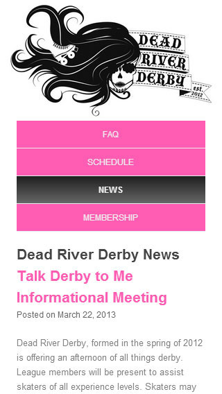
In the image to the right, you can see what the news page looks like on a smartphone. The logo scales to fit the screen and the horizontal navigation menu converts to a vertical menu.
When a user hovers a pointer device over menu items, the pink background changes to a dark gray gradient. Also, the menu signals the user which page they are currently on by maintaining the hover state on the respective menu item.
The site currently contains frequently asked questions, a schedule of upcoming bouts, a news feed, and detailed information about membership options.
In the future, we’ll be adding a bio section which will include info and photos of all active skaters.


Leave a Reply