
Tag: Graphic Design
-
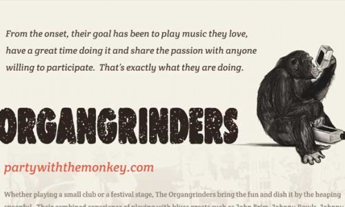
One-sheet Design for the Organgrinders
The Organgrinders were in need of a new one-sheet. They wanted something really professional looking that could be emailed or printed. A good one-sheet is essential for booking efforts and promotion to festivals, clubs, radio, weddings, blues societies, and blues publications/reviews.
-
White’s Party Store, a true Marquette original since 1947
White’s Party Store now has a web site! Known throughout the area for their personalized customer service, and great selection, White’s is the place to go. White’s is a classic Marquette neighborhood store specializing in quality wines, beers, liquors, and brewing and wine-making supplies. Their new web site includes a photo gallery, historical information about…
-
January 2011 Poster Design for Harley’s Lounge
Happy New Year everybody! I wanted to start out 2011 with a clean, refreshing design. The January poster for Harley’s Lounge represents this with special attention paid to the white space (a.k.a. negative space) between elements. This gives it a very well balanced and inviting look. The design is framed by a dual border of…
-
December 2010 Poster Design for Harley’s Lounge
The December poster for Harley’s Lounge is designed to help you get into the spirit of the holiday season. Besides the festive wreath near the title, it features a blue sky and off-white snow banks with a few snow-laden coniferous trees scattered about. The placement of the trees was entirely inspired by Bob Ross, the…
-
November 2010 Poster Design for Harley’s Lounge
As the seasons change, it’s a good time to reflect back on the pleasant Autumn weather we’ve had this year. In the November poster for Harley’s Lounge, I wanted to pay tribute to the end of Autumn by using faded, discolored leaves. They poke in from the top and both sides to create a pseudo…
-
October 2010 Poster Design for Harley’s Lounge
The October poster for Harley’s Lounge was inspired by The Twilight Zone. The intro scene to the television series featured a dark background with stars shining and various objects floating by as if they belonged in the depths of space. The poster includes a view of our galaxy from afar as the backdrop with the…
-
September 2010 Poster Design for Harley’s Lounge
The September poster for Harley’s Lounge features a photo of an old Polaroid camera at the top. This camera represents those special moments in life that can be captured instantly, but will eventually fade away to be replaced by others. The camera sits on a wooden shelf and is peaking out from underneath a dark,…
-
August 2010 Poster Design for Harley’s Lounge
The August poster for Harley’s Lounge features the Mayan calendar both as the center piece as well as the background. In the center, it is covered by white splatter which makes the title easier to read. For the background, I used a gray, brushed metal texture. Also, the large Mayan calendar in the background is…
-
July 2010 Poster Design for Harley’s Lounge
The July poster for Harley’s Lounge incorporates a military-industrial style in honor of my brother who recently re-enlisted in the service. The font used is Stencil BT for that “military crate” look. The color scheme for the copy is based on camouflage and includes various greens, rust brown and gray. A light drop shadow helps…
-
June 2010 Poster Design for Harley’s Lounge
For the June poster design, I used a close-up photo of some old barn wood for the background. I love the rugged look of the wood. It has such a great, weathered character and so much depth. I added a little flare and contrast with three brightly colored gears. The way the gears overlap each…
-
May 2010 Poster Design for Harley’s Lounge
For the May poster design, I used a photo of the rocks at Presque Isle on the shore of Lake Superior for the background. By laying a close-up image of the rocks over the clear blue sky, I achieved an effect similar to satellite imagery of clouds.