
Just finished a beautiful responsive web site for Superior Eye Health and Vision Therapy Center. The site was part of an identity overhaul that also included redesigning their logo and designing a flyer for the Fall Frame Show. I had a great time working on this project and I’d like to take this opportunity to share some of the details with you.
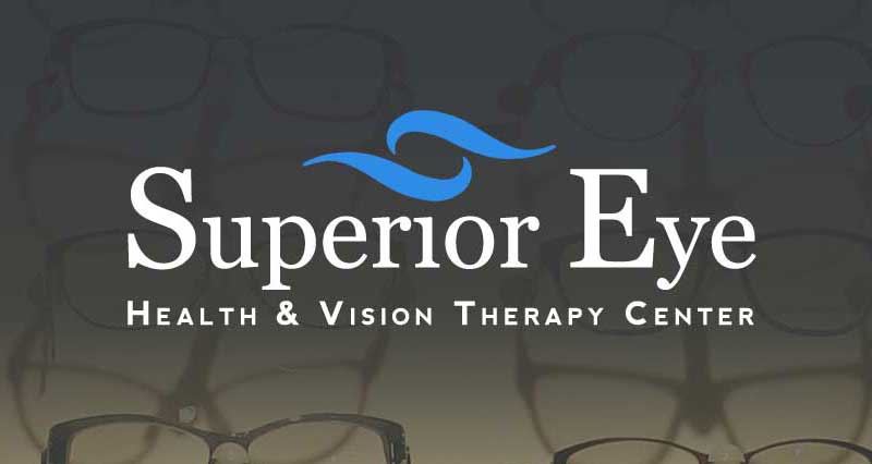
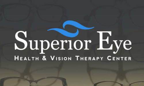
Logo Redesign
Superior Eye Health and Vision Therapy Center is an optical business that offers many unique services for the Marquette area. In need of an updated online presence that would set them apart from the local competition, Superior Eye came to me for help.
They were suffering from a confusion of identity. Over the years, many different versions of their logo had been developed and used. Before anything else, I had to consolidate their logo and the visual identity of their brand. This was important for developing continuity across platforms and channels. The new logo features their familiar swooshes, a serif and a sans-serif typeface. The typographic balance and readability have been greatly improved.
Responsive Web Design
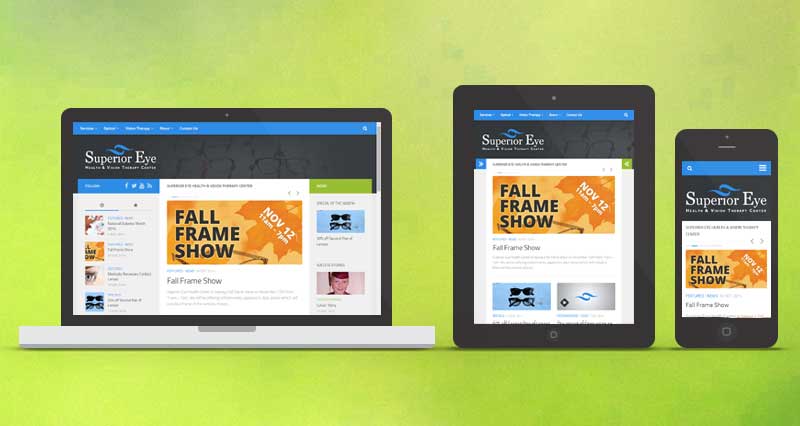
Their existing web site was outdated and difficult to use. So, I created a new website for Superior Eye that focuses on User Experience (UX) with a massively improved User Interface (UI). The goals of the new website are to improve public perception, expand awareness of the brand, and educate patients. We all know what Responsive Web Design is by now, right? The new Superior Eye website was designed to operate responsively to the screen size of the device it’s displayed on. Therefore, it will function well on smart phones, tablets, laptops, and desktops. Hurray!
Layout Logistics
So, the layout of this responsive web site is… responsive, right? Yes. At very small screen sizes, the site is one full width column of content with sidebar stuff pushed down below. As the screen size gets bigger (you can also see the different states by resizing your browser), small arrows become visible on each side of the screen. When clicked, the full sidebars expand from the side of the screen. Click again to close the sidebar. As the screen size gets even bigger, the left sidebar becomes fully visible, but the right sidebar remains as an expandable option. At this size the logo changes from center justified to left justified. At full size, the site consists of a three column layout including a left sidebar, center content, and right sidebar. Recent posts and popular posts can be found in the left sidebar. Specials and Success Stories can be found in the right sidebar.
Kingdom of Content
While the responsive layout is super neato, it wouldn’t work without good content. The new site has a lot of content. There are roughly 25 pages and 70 posts at the time of this writing. Important posts are showcased in the featured post slider on the homepage. The most recent remaining posts are listed below. Older posts can be found by clicking the pagination links at the bottom.
Nearly every page and post has a featured image as well. This image is displayed near the top of the page or post except for the video custom post format which shows an embedded video instead. Featured images also show up in other places such as the sidebars and the homepage.
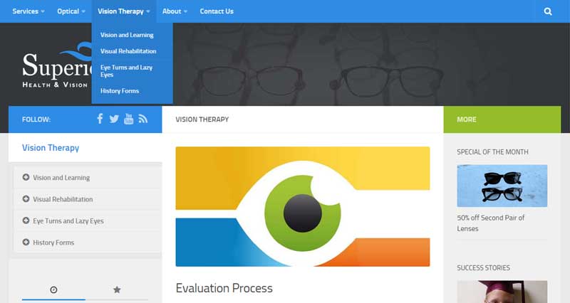
The primary navigation menu is (#2e8ce6) blue. This is the same color of blue used in the logo and throughout the site. The menu contains links to all the pages on the site. Also located here is the handy search bar that allows you to search the entire site. You can see the drop-down menu in effect when hovering over any of the links with small arrows next to them. Clicking on the main link brings you to the parent page. Clicking any of the links in the drop-down brings you to a child page. As you can see in the left sidebar, parent and child pages have an extra menu that allows the user to navigate through all related pages easily.
Social icons in the left sidebar link to Superior Eye’s various social networks and RSS feed.
The new site features a sticky menu (aka persistent menu) that remains visible at the top of the browser no matter how far you scroll down the page. This makes it very quick and easy to navigate the site with the main menu.
Let’s not forget this is a responsive web site. On smaller screens, the navigation menu becomes a mobile-style dropdown menu that saves space and keeps it looking clean while maintaining a high level of usability.
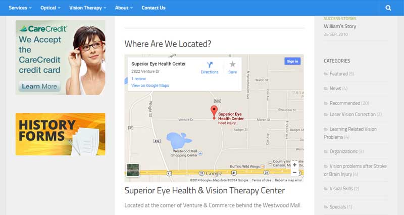
An interactive Google map is embedded on the contact page. With this map, users can zoom in and out, pan, visualize the location, and find directions.
History forms must be filled out by all of Superior Eye’s new Vision Therapy clients. It was a smart move on their part to make them downloadable. Although these downloadable history forms can be found in the navigation menus, the importance of their utility required more visibility. I created a custom graphic and used it to link the history forms page from the left sidebar directly under payment options.
The site’s blog categories are listed in the right sidebar along with how many posts are in each. Along with the search bar, this is another great way to quickly find specific content on the site. Whether your looking for success stories, specials, news, recommended links, or video, you can find it all here.
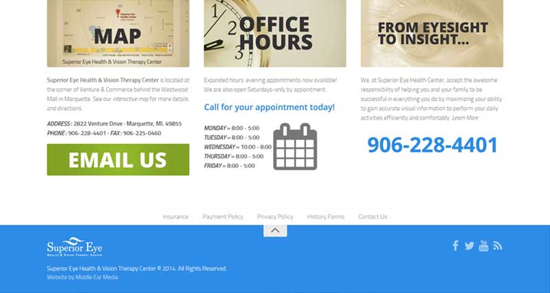
The footer is an important and often under utilized area of a website. This site puts the footer to work with links to the interactive map, office hours, the About page, and an attention grabbing call to action (CTA) in the form of an “Email Us” button that links to the contact form. Other information found in the footer included the address, office hours, the first paragraph of the mission statement, and the telephone number.
The footer navigation menu contains links to Insurance, Payment Policy, Privacy Policy, History Forms, and Contact Us. Just below this menu is a button that auto scrolls the user back to the top of the page. At the bottom of the footer is a blue section that contains a mini logo, copyright info, and the social media links again.
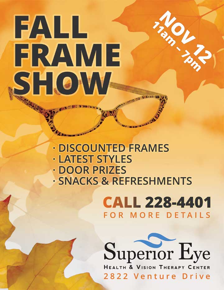
Flyer Design
Superior Eye is having a fall frame show on November 12th, 2014 from 11am – 7pm. They’ll be offering refreshments, appetizers, door prizes (which will include a frame of the winners choice), and discounts for anyone who purchases eye wear that day. They had me do the graphic design for a flyer that was printed and locally distributed to promote the event. Of course, the flyer can also be seen on the website.
Leave a Reply