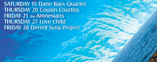
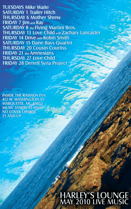
For the May poster design, I used a photo of the rocks at Presque Isle on the shore of Lake Superior for the background. By laying a close-up image of the rocks over the clear blue sky, I achieved an effect similar to satellite imagery of clouds.

I chose a sans serif font for readability. The final design is very vibrant and shows the natural beauty of Marquette in May. Harley’s Lounge is one of the few venues in Marquette that supports local music and I am proud to design their monthly posters.


Leave a Reply