
Earthkeepers II is an environmental initiative of the interfaith community in northern Michigan that now has a professional logo and website. I recently had the honor of designing their identity and giving them an official home on the web.
Earthkeepers II consists of ten faith traditions involving 250 faith communities in Michigan’s Upper Peninsula. They are partnering with the US Environmental Protection Agency, the United States Forest Service, and the Keweenaw Bay Indian Community during 2013-14. The Cedar Tree Institute, a nonprofit organization which provides services and initiates projects in the areas of mental health, religion, and the environment, is coordinating the Initiative.
Efforts will focus on increasing energy efficiency in use and maintenance of buildings owned by 40 faith communities across the Upper Peninsula. Energy audits will be conducted, educational forums will be held, and mini-grants for faith communities will be distributed. Along with this effort, Earthkeepers II will build on a vision to establish and maintain interfaith community gardens.
Earthkeepers II identity
When approaching the identity of Earthkeepers II, I wanted to convey a strong sense of community cooperation. Also, the environmental concerns at the heart of the project needed to be reflected strongly.
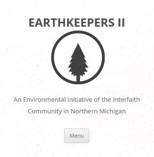
Earthkeepers II logomark design

The logomark aims for simplicity with a white background and dark gray foreground. It incorporates a simple tree in a circle.
The tree is representative of the environmental concerns of the group. The circle stands for the cyclical nature of all things as well as the strength of unity and cooperation.
Earthkeepers II logotype design
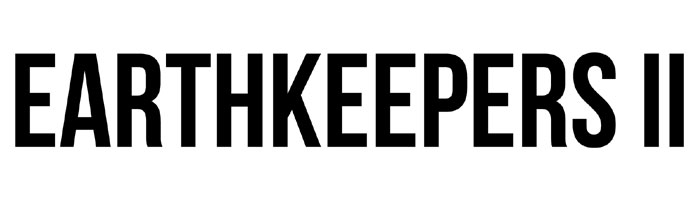
The logotype uses the Bebas Neue typeface for several reasons. The compact letter width helps minimize the space required. The thick, consistent stroke-width of the letters, along with the tight spacing, create a strong horizontal rhythm. The sans serif letters give the logotype a clean, modern look.
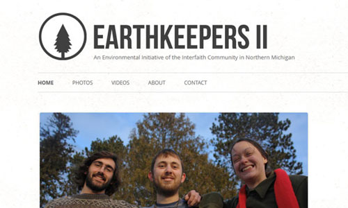
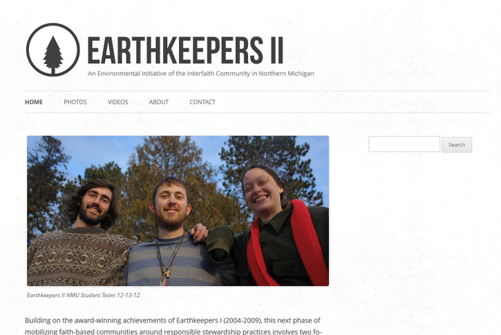
Earthkeepers II website design
 I designed a website to serve as the definitive source of information about the Earthkeepers II project. The site was built with a mobile first responsive design so it looks and works great on any device. This was done to ensure the information is readily available to everybody.
You can see this in effect, particularly in the header and navigation menu, by loading the page and resizing your browser window. Or, check it out on your smart phone. The mobile first aspect of the design guarantees that only the necessary resources are loaded on any given device.
The site is based on a fast loading, simple, minimalist design that focuses on content. WordPress was used as the content management system. Currently featured on the site are highlights about the initiative, a photo gallery, a video gallery, and contact information. The website is set up to be easily updated and modified as needed in the future.
Leave a Reply