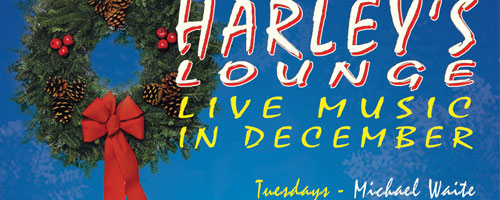
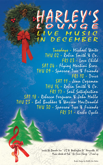
The December poster for Harley’s Lounge is designed to help you get into the spirit of the holiday season. Besides the festive wreath near the title, it features a blue sky and off-white snow banks with a few snow-laden coniferous trees scattered about. The placement of the trees was entirely inspired by Bob Ross, the famous painter. The red treble cleft with red ribbon represents the gift of music that is being offered by Harley’s Lounge this month.

The single font used throughout the design is Staccato222 BT. I used this font for its rounded, hand-drawn character more than it’s readability. To increase the readability, I used colors that strongly contrast against the background. Off-white with red shadow for the title, yellow for the sub-title and the dates, and off-white for the band names show up nicely over the dark blue background. Dark gray for the small text at the bottom works well over the off-white background. All of the copy is right justified and is sized and colored to lead the eyes from top to bottom.
Harley’s Lounge is one of the few venues in Marquette that supports local music and I am proud to design their monthly posters.


Leave a Reply